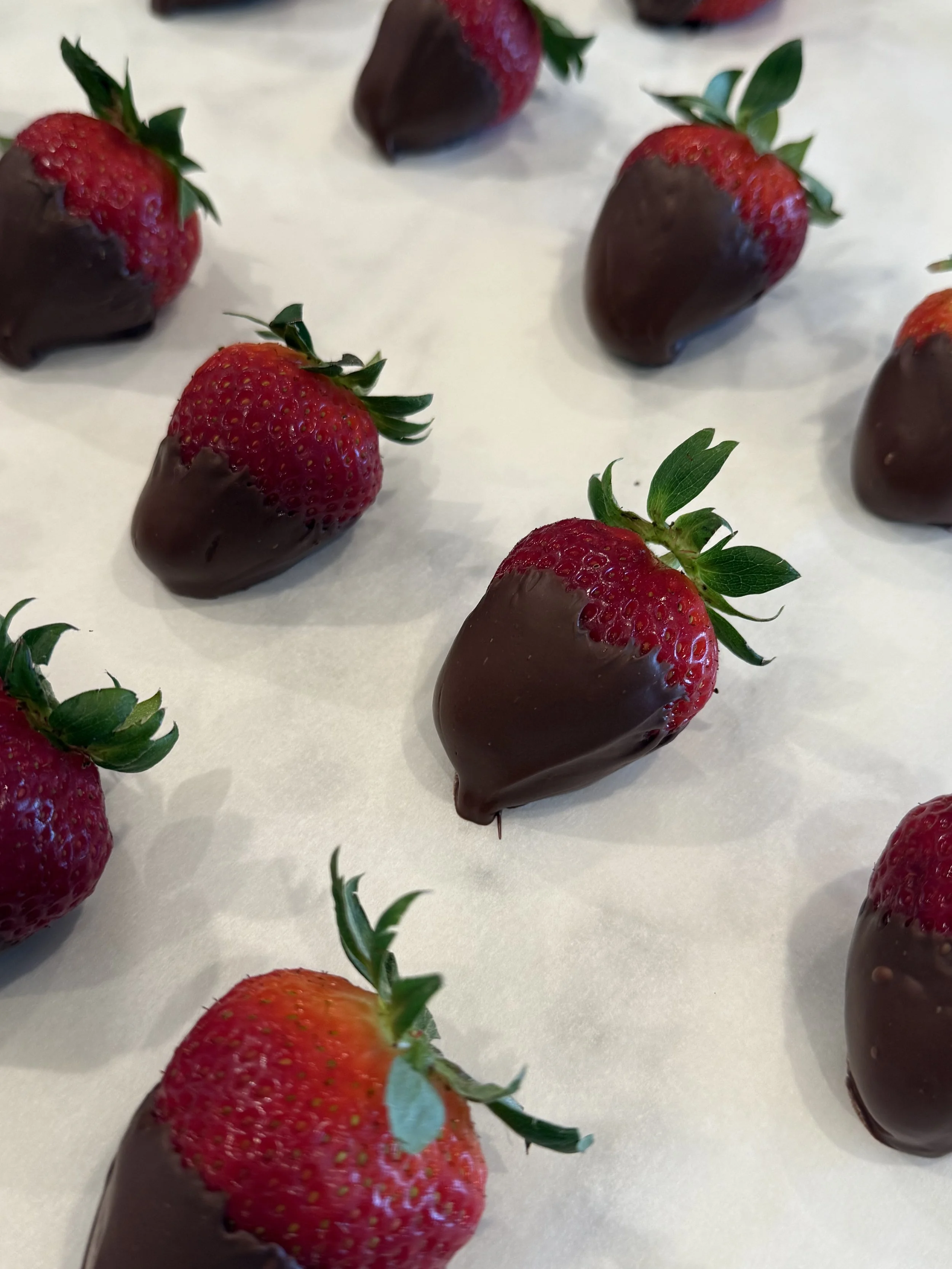
A Valentine’s Treat
True Love!
My heart’s desire knows… opposites attract.
Good and evil. Oil and water. Black and white.
Complimentary colors are two old friends positioned directly across the round wheel of color. Primary, secondary, and tertiary colors are natural, comfortable, seamlessly interacting all the while creating impact, drama, contrast.
One is warm. The other cool.
Take our favorite Valentine’s treat - chocolate covered strawberries. Examine the fruit. Vibrant, green tops on bright, red bodies. The ultimate gift. Nature has done it again… and again, and again.
Pansies dance in the garden with their yellow and purple petals.
An orange sun sets against the crisp, blue sky.
Ripe, red fruit hang amongst a collection of waxy, green leaves.
Marketing, be it companies, institutions, athletics, or countries, relies on complimentary colors. Blue and orange clad Boise State co-eds cruise campus gulping Fanta. Gucci’s red and green iconic stripes mark handbags traversing the streets as Italian flags wave overhead. We remember Kobe Bryant’s purple and gold jersey sporting the number 8.
Two complimentary colors dictate a room’s décor. Use both evenly in paint and fabric or choose one color to dominate, the other to accent. Sweet cherry wallpaper with green grass bedding. A lone citrus pillow sits atop a denim davenport. Deep burgundy flocked walls surround golden velvet banquettes.
Taking nature’s lead, with purpose. Reach across the circle and celebrate. Whose “color” compliments you?
Happy Valentine’s Day!
