In Contrast…
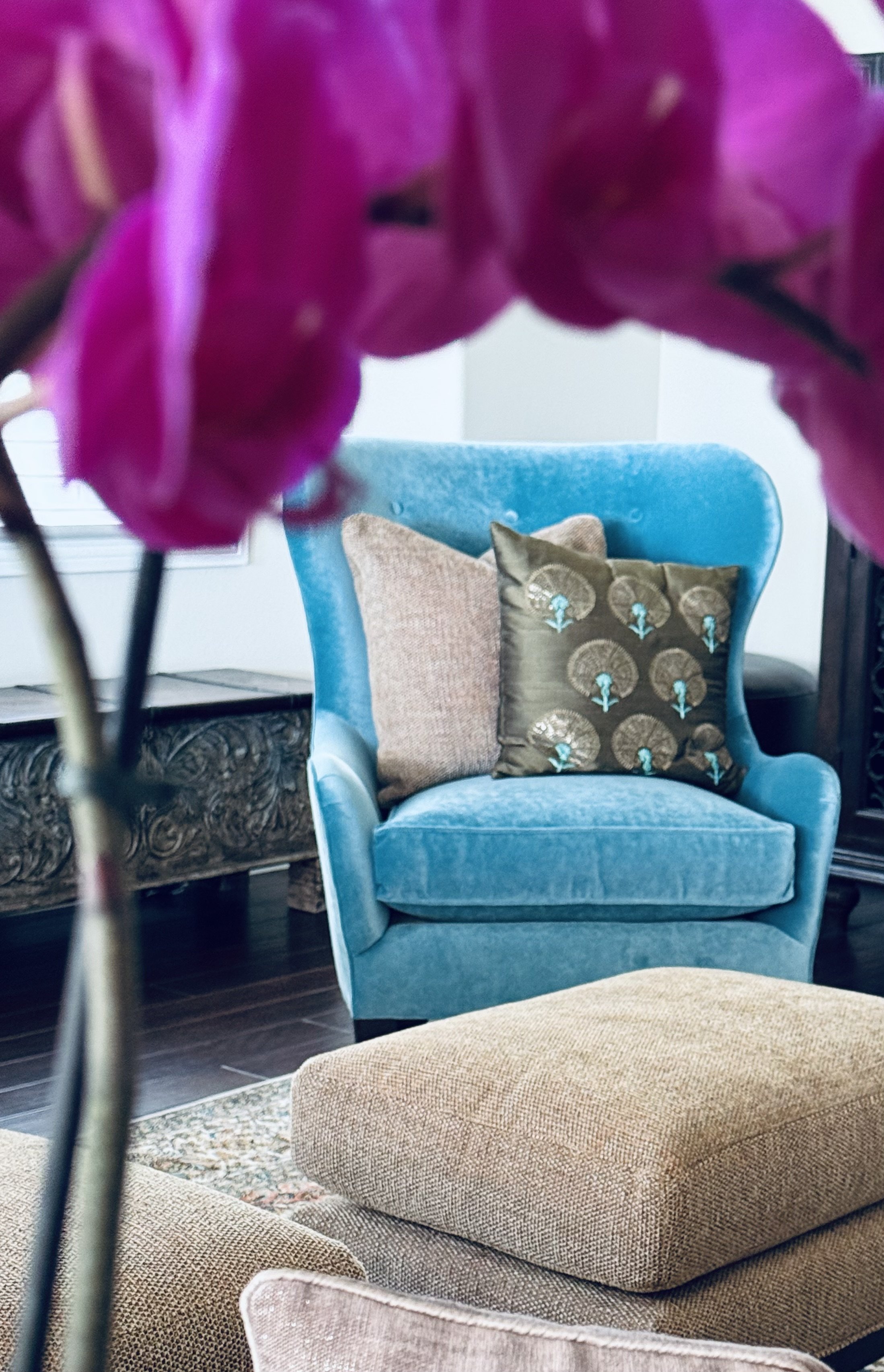
The turquoise velvet Lady Boss.
SEVEN PRINCIPLES OF DESIGN
BALANCE HARMONY EMPHASIS RHYTHM SCALE CONTRAST UNITY
Contrast is the juxtaposition of opposing elements.
Light - Dark Large - Small Rough - Smooth
Used to create visual interest, contrast is vital to design. It establishes an hierarchy. It highlights key information. It reduces monotony. It guides a user’s attention to a focal point.
Occuring when two or more visual elements are different in a composition. A red pillow in a white room. A tall plant next to a low slung sofa. A rough stone bowl on a smooth glass coffee table.
Contrast is visual impact.
Color, size, shape – all are used to provide foil.
Above. A client’s home. An inviting family room. Two plush camel-colored sofas. Spice tweed ottomans. Earth’s neutral shades of sand, stone, caramel layered. Then,
Bam
She sits there. Who me? Innocently perched on the corner of the rug. Facing the crowd. The masterpiece commandeering the room. Instant contrast. Drama.
The turquoise velvet Lady Boss.
You too, can add decorating distinction.
Afraid? Contrast is not necessarily permanent. It can come and go. Fresh flowers, fuzzy throw pillows, fruit in a bowl.
Baby steps. Just a little to make you smile? One colorful chair, mixed metals, pattern play varying size and shapes.
Drama! Ready to jump in head first? Black and white checkered floor, an accent wall, show stopping art, graphic wallpaper.
Chaos can ensue if contrast isn’t contained.
Introduce with purpose. Stand back. Evaluate. Take a picture. Send it to me… together, we can do this thing called decorating.